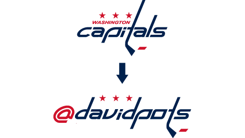
While on a recent plane ride, I embarked on a self-imposed quickfire challenge to use Adobe Illustrator to design the text “@davidpots” (my Twitter username) in the style of the Washington Capitals logo. I was armed with only 45 minutes and a vector version of the Capitals logo; no internet connection would be at hand for additional assets (such as fonts, etc).
By the end of the plane ride, things worked out great:

Throughout the remainder of the post, I’d like to share an overview of the approach I took and the Illustrator techniques used to make this happen. The result is not merely a tutorial, but rather a broad look at some Illustrator skills any user might find helpful in such a situation.
Start With What You’ve Got
First step when resources are short? Make the most of what you’ve already got. While in a perfect world I’d have access to the font on which the Capitals logo is based, in this case I’d have to make due with the letters (or rather, shapes) that make up the source logo I was starting with.
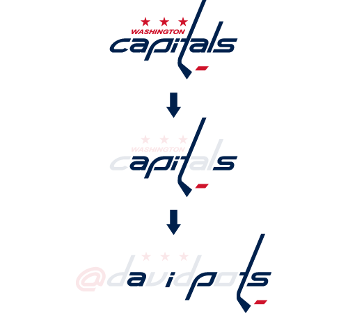
Fortunately, “Capitals” and “@davidpots” have quite a few letters in common. My first move was to ungroup the shapes in the “Capitals” logo and move all letters that matched into their proper placement in their “@davidpots” counterpart.

After this first step alone, about half of the letters are already in place. What’s left? Creating the “@”, “d”, “v”, and “o”. Onward we go.
This Shape + That Shape
To create the remaining letters, I would have to create custom shapes based on the contours of existing elements. This would ensure the overall look & feel of the logo remained consistent.
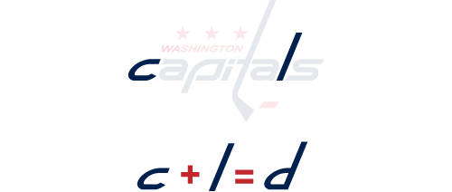
Starting with the “d”, I saw that the base contours I’d need already existed in the “c” and the “l”. Through combining these two objects, the resulting “d” would retain the general shape of these other letters.

So far so good. While the remaining letters wouldn’t necesarily be as simple to create, the basic premise & approach would be the same.
Take This, Tweak That, and Drop the Rest
Next up is the letter “v”. After a moment’s investigation, it seemed the best way to recreate the bottom point of the “v” (with existing elements of “Capitals”) is through the upper-right corner of the letter “p”.

Unlike the creation of the “d”, this would require a bit more work. Instead of simply combining two separate letters to create a third, I would instead be transforming & tweaking part of a letter and then getting rid of the rest. I did it like this:
First, rotate the “p” 180 degrees…

Second, use the direct select tool to increase the height of the left “arm”

Third, use the Pathfinder’s divide function to get rid of excess shape at the top

And that’s it! The “v” is ready to be inserted into its namesake.

The exact same approach was used to create the “o”. Starting with the already-existant “p”, (1) the shape is divided, as to get rid of the unnecessary bottom stem. (2) Next, the remaining “corner” is duplicated & rotated 180 degrees. (3) Finally, the two remaining pieces are moved into place to form the “o”. Voila!

Round the Corner(s) & Tie Up Loose Ends
The final and most challenging letter to create was the “@”, which would require the most alchemy of the bunch. In summary, my plan would be to first (1) create the interior shape of the symbol, and second (2) use an external stroke to create the “wrap around” shape of the symbol — this would ensure the curves were 100% right-on. Here’s how I made it happen:
Creating the inner shape
The first step was creating the inner shape of the “@”. Locating all I would need in the base of the “d” contour, I simply created a dividing line and used the Pathfinder’s divide tool to make a clean cut:

Rounding the Corners, Part 1
So far so good — but I realized that I would need to round out the corners on the right-hand side of the shape I created (lest the sharp/jagged run wild and free). To make this happen, I first (1) spotted an existing corner “curve” in the “p”, (2) used the Pathfinder’s divide tool to isolate this corner, (3) and finally shifted this over into the contour of my original shape.

Rounding the Corners, Part 2 The previous “round the corner” approach was used one more time for the upper-right corner of the shape. This time I used an existing corner from the “a” to make it happen. Same basic steps:

Creating the Outer Wrapper In order to create an outter wrapper for the “@”, I decided to use the object’s stroke. This would ensure the curves remained consistent in both contour and width. To make this happen, I first (1) gave an exterior stroke to my original object. Next, (2) an additional stroke of then wrapped around the shape again. Finally, (3) after expanding the strokes into proper shapes (Object > Expand), I used the Pathfinder’s divide tool to get rid of the undesired middle “red” section.

Finishing Touches The very last step involves tweaking the lower-right section of the shape to complete the “@” transition. This involved (1) using the Pathfinder’s divide tool to once again get rid of the undesired portion of the outer wrapper. (2) Next, I created a small curved shape to join the two shapes, which was (3) moved into place and combined with both shapes to complete the task.

And We’re All Done!
And there you have it! All shapes have now been created. I needed only to align the items as desired and save my final product (which I now proudly wear as my Twitter profile pic in support of the team).

Could this have been arrived at quicker if I had the original “Capitals” font to work with? Of course! But that is removed from the point: this was instead about the challenge of a self-imposed quickfire task which forced me to think quickly & make the most of the resources at hand.