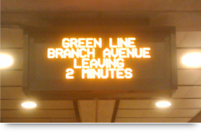
Riders of the DC metro are familiar with the signs in each station telling when to expect the next train. These signs are no doubt helpful, but tragically constrained to their fixed physical locations. What if we could view these signs on the desktop of our mobile device, saving us the step of clicking down through an app or website? In this post, I design a theoretical Android widget that imagines what this experience might be like.
I should first note that there are already websites and mobile apps that fulfill this need, answering that important question of “when is the train coming?” But I think this experience still has room for improvement, particularly when it comes to the mobile experience. Specifically, I’m interested in reproducing the experience of quickly looking at a sign, both in its visual aesthetic and the quick-casual-glance nature of the behavior.
The solution? A widget on your phone’s desktop, showing train arrival times at the station of your choice. Wherever you may be, a quick look at your phone would give you the information you seek. Done as a design exercise, below are some mockups of what such an app/widget might look like.
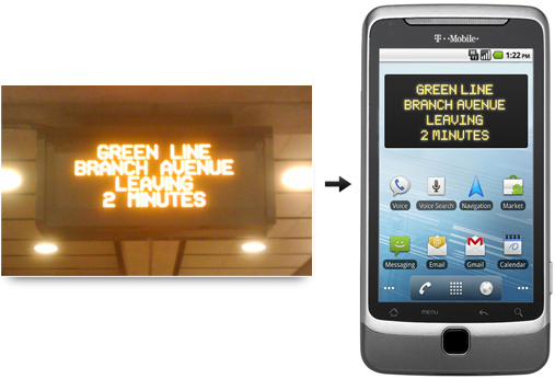
Putting this idea into form, I first created a very literal translation of the sign that greets me when arriving at the Greenbelt metro. I designed this as an Android widget, taking up a reasonable four columns by two rows of desktop space.
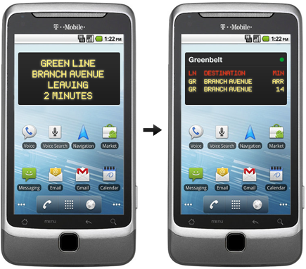
Immediately I realized that Greenbelt is in a relatively rare situation amongst it metro station peers: it is at the end of a line, and all trains go in a single direction. A more practical widget solution would need to account for stations with trains going in multiple directions — and possibly, on multiple metro lines (i.e., green, red, etc). For design & layout, I found easy inspiration in the great UI work done by David Desandro and Ian Storm for their recent Next Metro app built for the 10kApart contest.
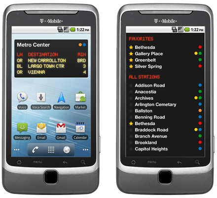
A nice look & feel for the widget in place, but a few more design challenges remain. How would users select the station to view, and how would they change to show other stations? Keeping this theoretical application/widget as simple as possible is the goal — so I believe a simple list would suffice. Let users mark certain stations as favorites, which would allow them to quickly find their preferred stations from the list of several dozen.
And there we have it! While not 100% of the UX details are in place, the vision for the widget (and background application) are set forth here. Would this be possible on Android, given, the unique ticker typeface in use? I’m honestly not sure. Any font would suffice, on a functional level — but my ultimate aim was to think about how the look at the sign experience we all know well could be directly translated on to the mobile devices we use every day.